

Why Brand Strategy is Essential for Charities: Lessons from Toilet Twinning’s Rebrand

A strong brand is more than just a logo—it’s a powerful tool that helps charities connect with their audience, raise awareness, and drive action. When done well, brand strategy ensures every aspect of a charity’s identity, from messaging to design, works towards its mission.
We absolutely love Toilet Twinning’s recent rebrand (shout out to Wildish & Co): it’s a brilliant example of how a strategic approach to branding can elevate a charity’s impact. With a refreshed visual identity and a bold campaign, the organisation has created an engaging, memorable brand that helps tackle a serious issue: global sanitation.
So, what can charities learn from this rebrand?
Strategy First: The Foundation of a Strong Brand
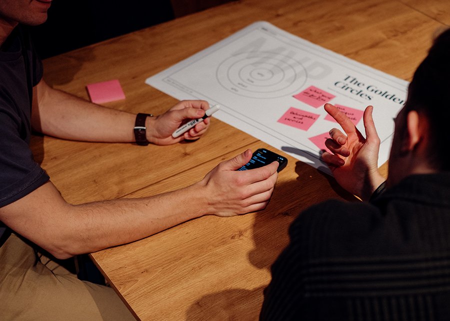
A successful rebrand doesn’t start with colours and logos—it starts with strategy. Before any design work began, Toilet Twinning needed a clear understanding of its audience, goals, and messaging.
The charity’s core mission is to fund global water, sanitation, and hygiene (WASH) programmes through Tearfund. But to achieve this, it needed to increase engagement, drive donations, and make sanitation a topic people actually talk about.
The strategy behind the rebrand focused on:
• Making the cause relatable – connecting donors with the impact of their support.
• Breaking through the noise – using a bold, distinctive approach to stand out.
• Creating consistency – ensuring every touchpoint, from digital to print, felt unified.
By taking a strategic approach, the charity laid the groundwork for a brand that could achieve its goals.
Audience Research: Understanding Who You’re Speaking To
A great brand isn’t just visually appealing—it resonates with the right people. Understanding the audience is crucial in shaping everything from messaging to design choices.
Toilet Twinning’s audience includes long-time supporters, churches, and a new generation of socially-conscious donors. The rebrand had to appeal across these groups, ensuring the messaging felt relevant and engaging to both digital natives and more traditional supporters.
This insight shaped key design decisions, like using a bold, friendly aesthetic that balances urgency with playfulness. The campaign’s tagline, Find Your Toilet’s Other Half, is a perfect example of how audience-focused messaging can make a serious cause feel engaging and shareable.

A Logo That Tells a Story
A logo is often the most recognisable part of a brand, but it should also communicate something deeper. Toilet Twinning’s new logo integrates a hand-drawn toilet icon, immediately linking the visual identity to its mission.
The rough-edged style isn’t just a design choice—it symbolises the grassroots, hands-on nature of the charity’s work. It feels authentic, personal, and full of energy, reinforcing the idea that donors are directly connected to the change they’re making.
The Power of Visual Identity: Colour, Typography, and Illustration
A brand’s visual language is just as important as its words. The right combination of colours, typography, and illustrations can make a message more impactful and memorable.
For Toilet Twinning, the vibrant blue symbolises trust and impact, while custom hand-drawn illustrations bring warmth and personality. The bold typography (Nikkei Journal Ultrabold for headlines and Knewave Regular for accents) ensures clarity and approachability.
Together, these elements create a brand identity that is both professional and playful—serious about its mission but engaging enough to get people talking.

Bringing It to Life: Animation and Digital Marketing
Branding isn’t just about static visuals. A modern charity brand needs to work across multiple platforms, from social media to print and video.
Toilet Twinning’s custom illustrations and animations make the brand feel dynamic and alive. Whether it’s in a digital ad, an Instagram post, or a fundraising email, the consistent use of these elements helps reinforce the brand at every touchpoint.
Messaging That Cuts Through
Great design attracts attention, but messaging moves people to action. The rebrand focused on playful but impactful language, using phrases like Far apart, but close at heart to create an emotional connection.
By keeping the messaging simple, engaging, and human, the campaign makes it easy for supporters to understand their impact—and share it with others.

Multi-Channel Approach: Meeting Supporters Where They Are
A successful brand strategy considers how people engage with a charity across different platforms. The Toilet Twinning rebrand was designed to work across:
• Social media – eye-catching content that encourages sharing.
• Print materials – clear, engaging messaging for events and church partnerships.
• Out-of-home advertising – bold visuals that stand out in public spaces.
This flexibility ensures the brand is recognisable and impactful, no matter where people encounter it.
Why This Matters for Your Charity
Toilet Twinning’s rebrand is a masterclass in how strategy, design, and messaging come together to create a powerful charity brand. But these lessons aren’t just for large organisations—any charity can apply them.
If your charity wants to:
✅ Engage a wider audience
✅ Build trust and recognition
✅ Increase donations and impact
Then investing in brand strategy isn’t optional. It’s essential.
At Bara Studio, we believe charities deserve brands that work as hard as they do. From audience research and brand strategy to logo design, illustration, animation, and messaging, we help purpose-driven organisations create brands that inspire action.
If you’re ready to take your charity’s brand to the next level, we’d love to chat. Get in touch with us today.